25 Inferential statistics
25.1 What are inferential statistics?
Many scientific questions can be formulated in terms of one or more populations which we want to understand. These could be populations of humans; for example, we might wish to understand the extent to which socioeconomic status predicts educational outcomes in the general population of schoolchildren. In the context of corpus analyses, these could be populations of music compositions; for example, we might study the extent to which parallel fifths occur in Baroque compositions versus Renaissance compositions.
A given scientific experiment can rarely work with an entire population at once. It is impractical for most scientists to collect educational outcomes for all schoolchildren in the world; likewise, it would be a nigh impossible task to compile digital encodings of all Baroque and Renaissance compositions in existence.
Instead, scientists normally work with samples. Samples are smaller datasets that are drawn from a particular population. The hope is that the sample is representative of the larger population, and that we can learn something from the sample that can be generalised to an insight about the population as a whole.
Inferential statistics are a special family of statistics that are designed to help us with this generalisation task. They are intended to help us to understand when certain conclusions can be conclusively drawn from a given dataset, and when other conclusions cannot be drawn with any confidence.
25.2 Distributions
When we talk about inferential statistics, we rely heavily on the mathematical concept of probability distributions. A probability distribution is a statistical model that tells us how our data samples are generated.
The most fundamental distribution in science is the normal distribution, also known as the Gaussian distribution. The normal distribution resembles a bell curve:

The shape of this curve tells us what values are likely observations: in particular, the higher the probability density, the more likely the observation. When we generate samples from the probability distribution, they will cluster around these values.
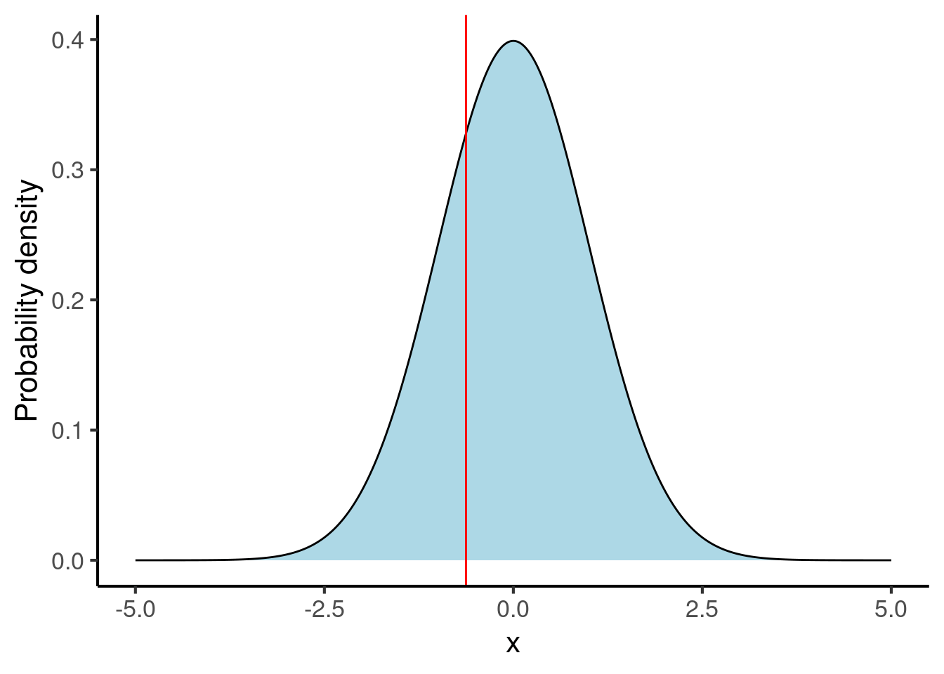
The normal distribution is defined by two parameters: its mean and its standard deviation. We encountered both of these concepts earlier in Chapter 24. The normal distributions above each have a mean of 0 and a standard deviation of 1.
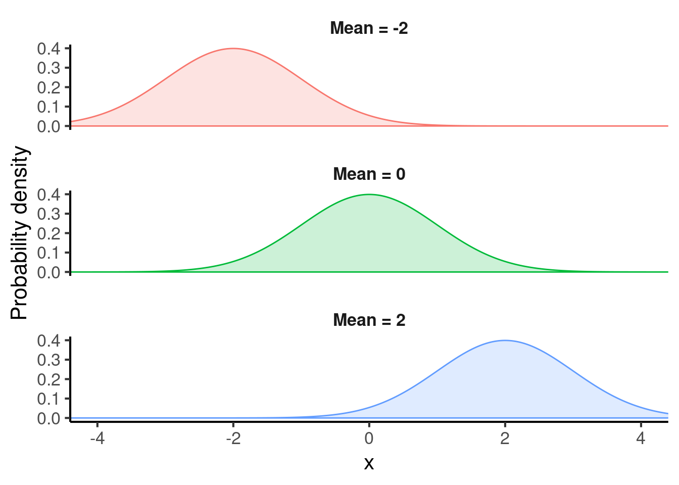
The mean controls the location of the normal distribution. Here are some examples of normal distributions with different means:
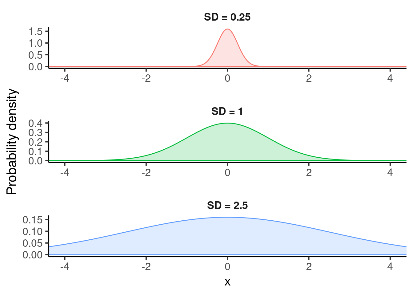
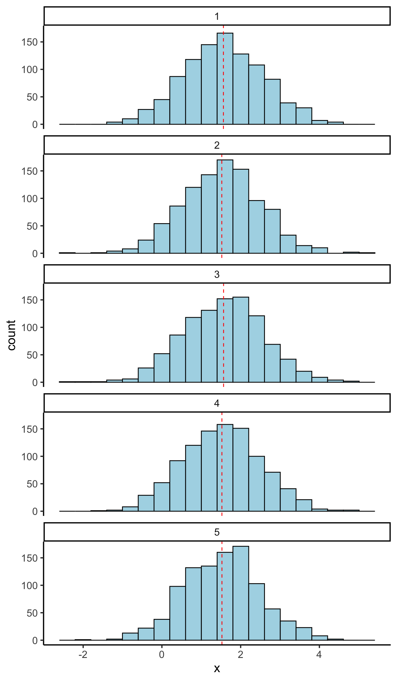
The standard deviation (often abbreviated to ’SD”) controls the spread of the normal distribution. Here are some examples with different standard deviations:
Much of inferential statistics can then be reduced to variants of the following logical process. We suppose that our population of interest can be modelled by some probability distribution, for example the normal distribution (which happens to resemble many real-world distributions strikingly well). We then try to infer the values of this distribution’s parameters, for example its mean and standard deviation, based on the data we observe.
25.3 Sample size and uncertainty
The size of our sample is crucial for determining our ability to infer the value of a distribution’s parameters. When we have only a few data values, our observations will be dominated by random chance. When we have lots of data values, however, the power of averaging will overcome the noise in the individual samples.
For illustration, let’s suppose we are trying to use data to infer the mean of a normal distribution whose true value is 1.5. In the first case, we’ll plot the results from 5 experiments, each of which estimate the mean based on just 10 observations:
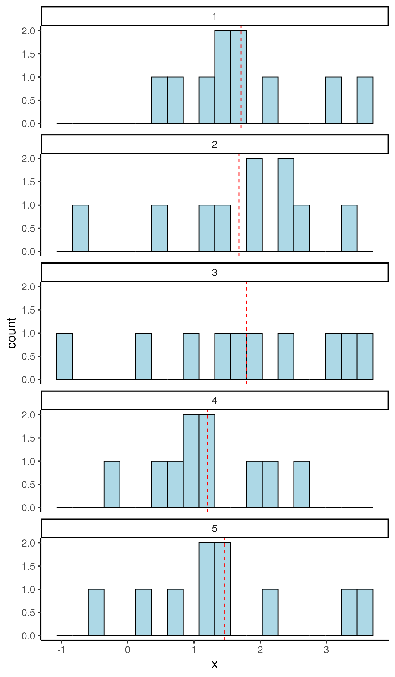
These estimates of the mean are rather noisy, with a standard deviation of 0.240. We call this value the standard error; it tells us how unreliable our mean estimates are.
Now consider an analogous set of experiments, each with 1000 observations:
Now the standard deviation of our means (our standard error) is 0.023, more-or-less a tenth of the original standard error. In other words, increasing our dataset size by a factor of 100 has made our estimates about 10 times more precise. There is a mathematical theorem called the Central Limit Theorem that formalises and generalises this observation, showing that in general if you multiply your sample size by \(N\), then your standard error will decrease by a factor of \(\sqrt{N}\).
The main takeaway message here is that increasing sample size reduces uncertainty. This is why sample size is considered a very important aspect of scientific studies; without sufficient sample sizes, we cannot rely on any of our conclusions.
25.4 Estimating uncertainty
In the example above we estimated our uncertainty in our mean estimations by repeating the same experiment five times and computing the standard deviation of the means. This is not a very practical approach in real-life experiments, because if we had five identical datasets we’d probably want to compute one mean over all datasets (hence achieving a higher effective sample size) rather than computing means over 20% of the dataset at a time. In this case we wouldn’t be able to take our same approach of computing the standard deviation of the means, because we’d only have one mean.
Fortunately statisticians have developed various techniques that allow us to have our cake and eat it: to generate standard errors for our estimates while analysing the whole dataset at once. These techniques are mostly straightforward with standard statistical software.
In the simple case where we are computing the mean of a dataset, it turns out that the standard error of this mean can be estimated by taking the standard deviation and dividing it by the square root of the sample size. This is a useful corollary of the Central Limit Theorem mentioned above.
Here is an example of computing the standard error of the mean in R:
data <- c(5, 7, 3, 4, 5, 6, 2, 3, 4)

sd <- sd(data)
sd
#> [1] 1.581139

N <- length(data)
N
#> [1] 9

se <- sd / sqrt(N)
se
#> [1] 0.5270463
In more complex data analysis methods, such as linear regression (see Section 25.7), most statistical software will return standard errors automatically, based again on various mathematical theorems.
A more general and powerful approach to computing standard errors is to use a technique called bootstrapping. Bootstrapping works by simulating thousands of artificial datasets and measuring the distribution of the relevant statistic in these simulations. We will not describe the details here, but it is worth being aware that the technique exists.
25.5 Representing uncertainty
It is good practice to provide uncertainty estimates when reporting statistics (e.g. means) in a scientific report. For example, we might report the mean of a dataset as follows:
The mean reaction time among the musicians was 700 ms (SD = 633ms, SE = 76 ms).
Here we have provided both the standard deviation (abbreviated as SD), which tells our reader about the spread of our data, and the standard error (abbreviated as SE), which tells our reader about the reliability of our mean estimate.
Often scientists will report something called a confidence interval instead of the standard error. A confidence interval provides a range of plausible values for a given statistic. Most commonly, scientists will report a 95% confidence interval; the idea behind a 95% confidence interval is that, if we repeated the same experiment infinitely many times, 95% of those repeats should give a mean within that confidence interval. As a rule of thumb, the confidence interval will typically correspond to the mean plus or minus 1.96 standard errors. So, if I have mean of 4.5 and a standard error of 1.5, then my 95% confidence interval will be [1.56, 7.44]. Confidence intervals can be computed automatically by most statistical software packages.
The general philosophy in scientific data analysis is to be conservative about interpreting the values of parameters. In particular, we try only to commit to statements that would only be true no matter what value we chose within the confidence interval. For example, suppose we had the following analysis:
The musical intervention had a mean effect of 1.5 IQ points (95% confidence interval: [-0.2, 3.2]).
In this case, we would generally not conclude that the musical intervention had a positive effect, even though the mean effect was indeed positive; this is because the 95% confidence interval still contains zero, so it is still plausible that the intervention had no effect.
It is conventional to represent uncertainty in plots using error bars. Here is an example of a plot containing error bars:
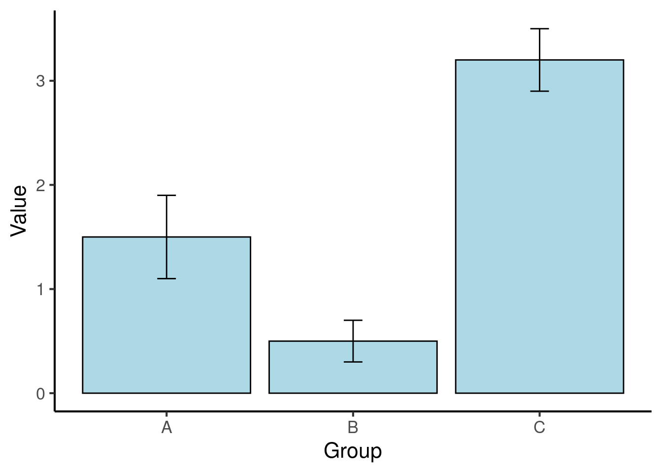
Figure 25.1: Means for three conditions in a fictional dataset. The error bars denote 95% confidence intervals.
When including error bars in a plot, researchers have a choice of three kinds of uncertainty statistics: confidence intervals, standard errors, or standard deviations. When plotting a confidence interval, the two tails of the error bar correspond to the lower and higher bounds of the confidence interval respectively. When plotting a standard error, the lower tail corresponds to the mean minus one standard error, and the upper tail corresponds to the mean plus one standard error; an analogous approach is taken for plotting the standard deviation, as in the example above.
The choice of uncertainty statistic to include in a plot is primarily up to the researcher. It is essential, however, to specify clearly in the plot description which kind of statistic has been included.
25.6 Uncertainty and repeated measures
A primary goal of experiment design is to reduce uncertainty. One way of reducing uncertainty is to take advantage of repeated-measures analyses. These analyses make intelligent use of repeated-measurement structure in the data to reduce uncertainty in parameters of interest.
Let’s consider a simple worked example. Suppose we have the following dataset, of IQ scores before and after a musical intervention:
Figure 25.2: A fictional dataset of IQ scores before and after a musical intervention. The red rectangles denote 95% confidence intervals of the means.
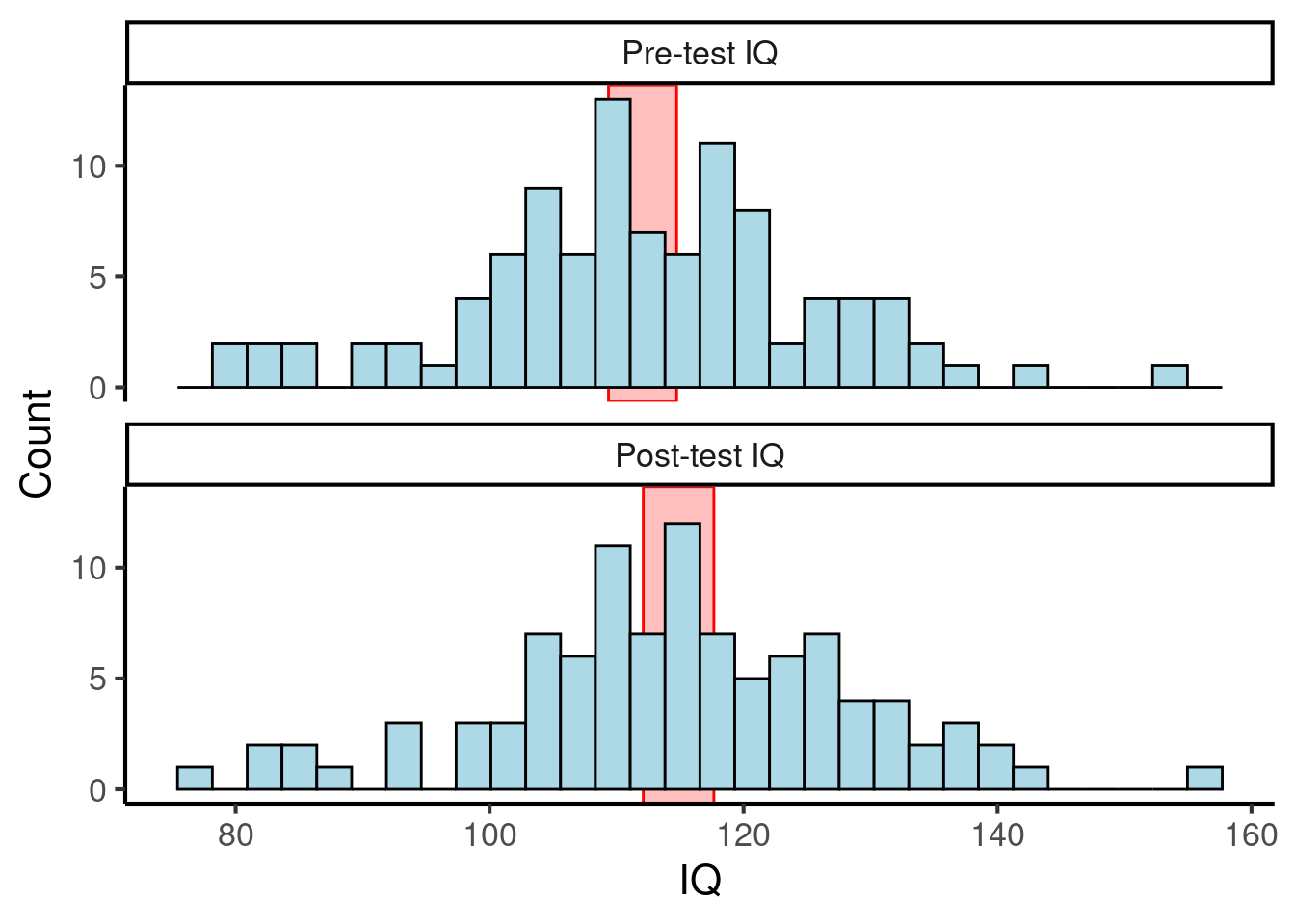
Figure 25.2: A fictional dataset of IQ scores before and after a musical intervention. The red rectangles denote 95% confidence intervals of the means.
Here the 95% confidence intervals of the means (plotted with red rectangles) overlap for the two datasets, so we can’t infer that there is any meaningful effect of the musical intervention on IQ scores.
However, suppose we construct a new analysis that better takes into account the repeated-measures structure of the data. In particular, suppose we compute a new variable, corresponding to the difference between pre-test and post-test IQ:
Then we can plot this new variable with a histogram:
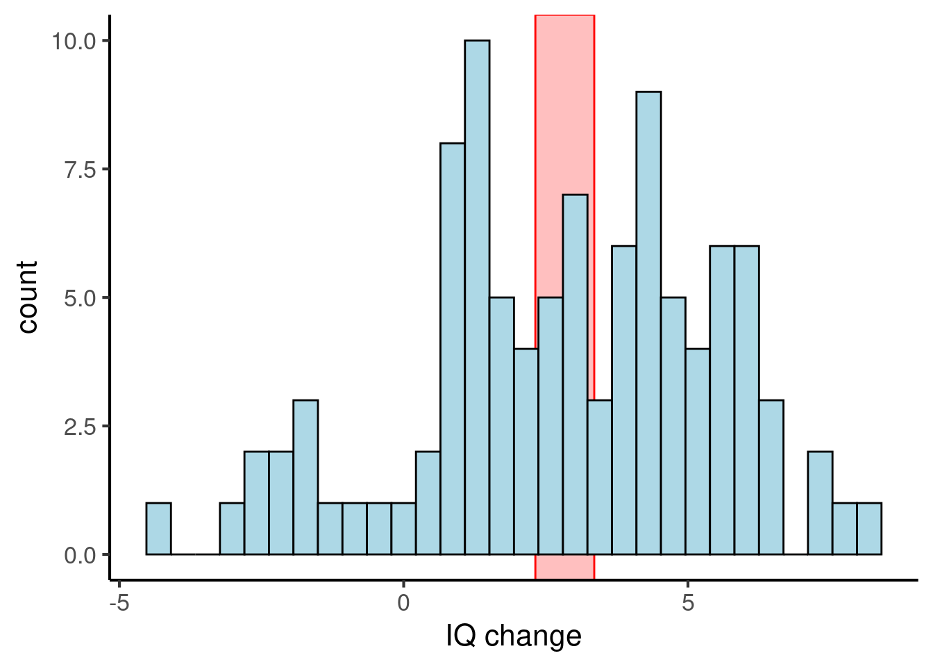
Figure 25.3: The same fictional dataset, but plotting changes in IQ scores. The red rectangle denotes the 95% confidence interval of the mean.
Now we see that the 95% confidence interval for the change in IQs is [2.3, 3.4], which does not include zero. So, we can conclude that the musical intervention did indeed induce a statistically reliable increase in IQ scores.
Why did we gain so much precision in the latter analysis? In the original analysis, much of the noise in the data came from individual differences in student IQs, which dwarfed the small changes induced by the musical intervention. However, the latter analysis controlled for this variation by subtracting the pre-test IQ from the post-test IQ, producing a dataset that isolated changes in IQ. This gives us a much more reliable analysis of the effect of IQ.
Many repeated-measures analyses can be formulated using differencing analyses like the one above. More complex repeated-measures structures sometimes need more complex analysis methods, however. There is a general family of analyses called mixed-effect analyses which are particularly well-suited to such problems; we will not consider these methods here, but it’s useful to know that they exist.
25.7 Linear regression
In science we often see variables that depend on multiple contributing factors, and we want to quantify the relevant causal contributions of each underlying factor. Linear regression is a technique designed to achieve exactly this.
Let’s consider the following example: we wish to understand how house prices depend both on floorspace and on number of rooms. Suppose we collect the following dataset of house prices:
Let’s start out by computing pairwise correlations between the two predictor variables and price (the outcome variable):
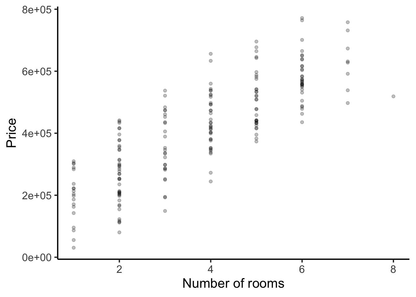
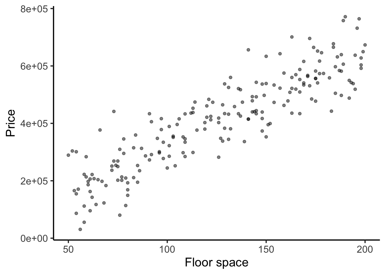
In both cases, we see strong positive correlations: houses with more rooms tend to be priced higher, and houses with more floor space tend to be priced higher.
Let’s now look at the same data through the lens of linear regression. The primary purpose of linear regression is to estimate marginal effects. Marginal effects tell us how the outcome variable would change if we adjusted one predictor while holding all the others constant.
We begin by fitting the regression model:
# Fitting the regression model
mod <- lm(price ~ rooms + floorspace, data = house_dataset)
We then plot the marginal effect for floorspace. As before, we see a positive association: increasing floorspace causes the price to increase.
# Plotting marginal effects requires the ggeffects package,
# you can install this with the following command:
#
# install.packages("ggeffects")

(ggeffects::ggpredict(mod, terms = "floorspace") %>% plot()) +
  scale_x_continuous("Floorspace") +
  scale_y_continuous("Price") +
  ggtitle(NULL) +
  theme_classic()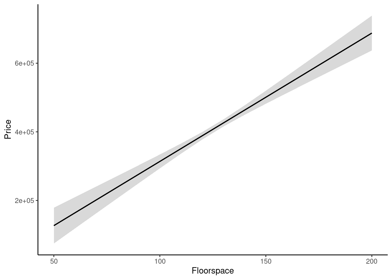
Figure 25.4: Marginal effect of floorspace on house price in a fictional dataset (95% confidence interval).
Now let’s plot the marginal effect of room number:
(ggeffects::ggpredict(mod, terms = "rooms") %>% plot()) +
  scale_x_continuous("Number of rooms") +
  scale_y_continuous("Price") +
  ggtitle(NULL) +
theme_classic() 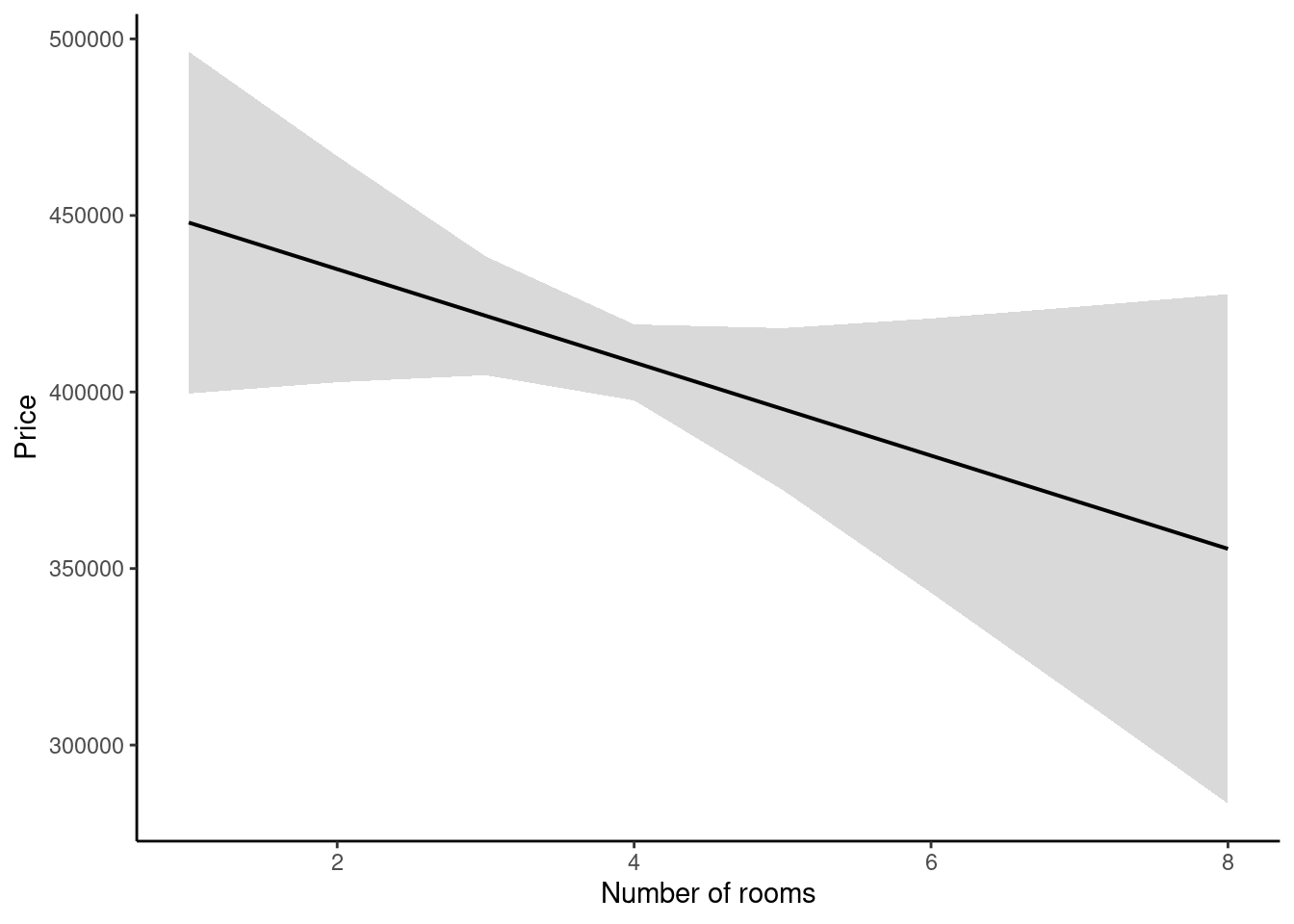
Figure 25.5: Marginal effect of room number on house price in a fictional dataset (95% confidence interval).
Interestingly, the previous association between number of rooms and house price is not replicated. The overall trend is decreasing (more rooms yields a lower price), but there is a wide confidence interval and the marginal effect might well be zero.
What do we conclude from this? It seems that the real driver of house prices is floorspace, not the number of rooms. Houses with larger floorspace tend to contain more rooms, but having more rooms doesn’t make them more valuable per se. Linear regression is a valuable tool in situations such as this, where we have multiple variables relating in a complex fashion, and we wish to estimate their causal effects on each other.
25.7.1 Linear regression and categorical variables
The example above illustrated linear regression with continuous predictor variables. However, it is also perfectly possible to perform linear regression with categorical predictor variables. In this case the marginal effect plot looks like a bar plot instead of a line plot.
25.7.2 Generating predictions from regression models
We have discussed how regression models can be used for explaining relationships between variables. However, they can also be used for generating predictions for new data points. For example, I can use the regression model from above to predict the price of a house with a floorspace of 125 square metres and 5 rooms:
predict(mod, newdata = tibble(rooms = 5, floorspace = 125)) %>%
  as.numeric()
#> [1] 391290
To compute these predictions manually, we need to have a look at the fitted model coefficients:
mod
#>
#> Call:
#> lm(formula = price ~ rooms + floorspace, data = house_dataset)
#>
#> Coefficients:
#> (Intercept)        rooms   floorspace
#>      -10397       -13201         3742
We take each coefficient and multiply it by the value of the corresponding predictor, then add everything together, also adding the ‘intercept’ coefficient. So in this example:
\[ \operatorname{\widehat{price}} = -10397 - (13201 \times \operatorname{rooms}) + (3742 \times \operatorname{floorspace}) \]
25.7.3 Interactions
An interaction effect is when the effect of one predictor depends on the value of another predictor. Interaction effects are easiest to conceptualise when one of the variables is continuous and one is categorical with \(N\) levels. In this case, the interaction effect works by estimating \(N\) versions of the continuous variable’s marginal effect, one for each of the \(N\) levels of the categorical variable. However, interactions can in general occur between all kinds of predictor variables.
25.7.4 Nonlinear regression
Linear regression assumes that all the marginal effects are straight lines. However, it is possible to generalise regression to incorporate nonlinear (wiggly) marginal effects, using techniques such as polynomial regression and generalised additive modelling. We will not discuss these techniques here but they are conceptually similar to linear regression models aside from their ability to capture nonlinearities.
25.7.5 Choosing appropriate control variables
Regression is often used to make causal inferences about particular domains. Many researchers are familiar with the idea that incorporating additional variables within a regression model, often termed ‘control variables’, can be an effective way to extract better causal inferences from observational data. However, it is less appreciated that incorporating inappropriate control variables can in fact increase inferential biases. It is worth doing some further reading about this topic if you are planning on such analyses in your own work, see for example Wysocki et al. (2022).
25.8 Null hypothesis significance testing
Null hypothesis significance testing is a particular approach to inferential statistics that dominated psychological research for much of the 20th century, and is still very prevalent today. Many modern statisticians however now have deep reservations about this approach, arguing that it does not answer the questions that most scientists actually want to answer, and that it encourages dangerous statistical misconceptions among the researchers that use it. These issues notwithstanding, the great majority of existing literature use these or related techniques, and so it is important to understand them even if one prefers not to use them oneself.
The basic principle in null hypothesis testing is that we use our data to falsify a null hypothesis that claims that our dataset is statistically homogeneous. For example, suppose that we are examining differences in means between two experimental conditions, ‘A’ and ‘B’. The null hypothesis is that these two conditions have the same population means. If our data falsify this hypothesis, then we can be confident that some difference exists between the means.
Null hypothesis significance testing relies particularly on the notion of the p-value. The p-value is a special statistic with a subtle meaning that many researchers misremember. It can be defined as follows:
The p-value is the probability that an effect equally extreme or more extreme than the present effect would have been observed were the null hypothesis to be true.
Suppose for example that we observed a difference of 3.2 IQ points between our conditions ‘A’ and ‘B’. The p-value would then tell us the probability that we’d observe an IQ difference of 3.2 or greater in the hypothetical world where ‘A’ and ‘B’ had the same population means.
Small p-values constitute stronger evidence against the null hypothesis. For example, \(p = .001\) means that we’d only see such a strong effect 1 out of 1000 times if the null hypothesis were true. This is very unlikely, suggesting that we must seriously consider the alternative: that a population difference does exist between the conditions.
It is conventional to use fixed thresholds for interpreting p-values, in particular the threshold \(p = .05\). If the p-value is less than .05, it is conventional to say that the effect is statistically significant. In this case, we are ‘permitted’ to say that we observed an effect in the data:
Members of the intervention group exhibited statistically significant improvements in IQ scores (\(p = .02\)).
In contrast, when the p-value is greater than .05, the effect does not reach statistical significance, and we are not allowed to claim that we saw an effect.
Members of the intervention exhibited no statistically significant improvement in IQ scores over the control group (\(p = .25\)).
In certain kinds of analyses (for example so-called post-hoc tests) this thresholding process is nuanced by the use of so-called familywise error correction, intended to control the level of false positives in a given analysis. We need not worry about the details of this here.
Null hypothesis significance testing is associated with a range of different statistical methods in the literature designed to work with different kinds of experiment designs. Examples include:
- t-tests
- ANOVAs
- Wilcoxon tests
- Friedman tests
- Kruskal-Wallace tests
Though the details of these methods vary, they all try to address a similar question: do the different experimental conditions have different population parameters, or do they have the same population parameters. You will generally see them reported with p-values, which you can interpret according to the definition provided above.
The use of null hypothesis significance testing in psychology is increasingly controversial. Arguably the biggest issue is that it works by trying to disprove a straw-man hypothesis. In psychology, almost any variable is correlated to some degree with almost any other variable, and almost any intervention will have some kind of effect if you look closely enough. It is not interesting to know whether the effect is absolutely zero or not, because we know that there will almost always be some effect. Rather, we want to know how big the effect is, and in what direction it lies. The p-value tells us nothing about this. This is why we strongly encourage the readers of the present text to focus on reporting confidence intervals in their analyses, and to design their studies around measuring the size of effects rather than testing whether effects exist in the first place.